Minimalism visualization by matplotlib - Bar chart
Overview
This post aims to simplify default bar chart by matpltlib as much as possible based on the philosophy of minimalist as below.
Prerequisite
In [1]:
import matplotlib.pyplot as plt
import numpy as np
import pandas as pd
%matplotlib inline
Bar plot
The key points are as follows:
- Clarify the key message
- Use comparison to show the size difference of data
- Think of what is the most effective way to convey the message
Default
In [4]:
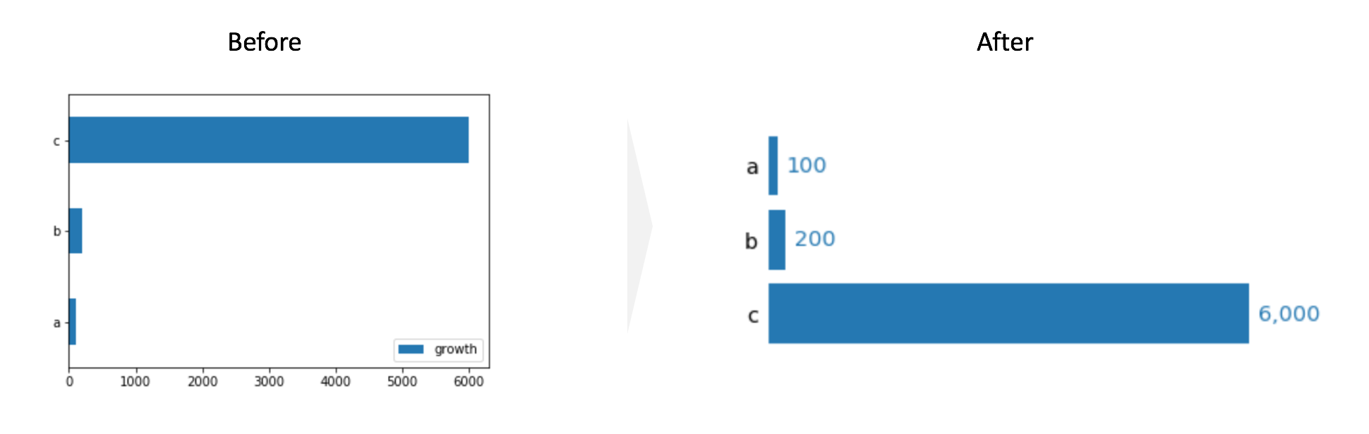
## Default
df_bar = pd.DataFrame([100, 200, 6000],
                  index=['a', 'b', 'c'],
                  columns=['growth'])
df_bar.plot(kind='barh');

Simplified Bar chart
- Delete legend
- Tighten the space between bars
- Re-order the y-axis
- Delete the square spines
- Delete ticks for x and y axis
- Delete tick label for x axis
- Increase the size of the label for y axis
- Display each value next to the bar
In [5]:
# 1. Delete legend legend=False
# 2. Tighten the space between bars width=0.8
width = 0.8
fig, ax = plt.subplots(figsize=(6, 3))
df_bar.plot(kind='barh', legend=False, ax=ax, width=width);
# 3. Re-order the y-axis
ax.invert_yaxis()

# 4. Delete the square spines
[spine.set_visible(False) for spine in ax.spines.values()]

# 5. Delete ticks for x and y axis
# 6. Delete tick label for x axis
ax.tick_params(bottom=False, left=False, labelbottom=False)

# 7. Increase the size of the label for y axis
ax.tick_params(axis='y', labelsize='x-large')

# 8. Display each value next to the bar
vmax = df_bar['growth'].max()

for i, value in enumerate(df_bar['growth']):
    ax.text(value+vmax*0.02, i, f'{value:,}', fontsize='x-large', va='center', color='C0')

In [38]:
## As a Function
def minimal_bar(series, ax=None, width=0.8, fisize=(6, 3),
               reorder_yaxis=True, splines_off=True, delete_ticks=True, y_label_large=True, display_value=True):

    if ax is None:
        fig, ax = plt.subplots(figsize=fisize)

    # 1. Delete legend legend=False
    # 2. Tighten the space between bars width=0.8
    series.plot(kind='barh', legend=False, ax=ax, width=width, color='C0');

    # 3. Re-order the y-axis
    if reorder_yaxis:
        ax.invert_yaxis()

    # 4. Delete the square spines
    if splines_off:
        [spine.set_visible(False) for spine in ax.spines.values()]

    # 5. Delete ticks for x and y axis
    # 6. Delete tick label for x axis
    if delete_ticks:
        ax.tick_params(bottom=False, left=False, labelbottom=False)

    # 7. Increase the size of the label for y axis
    if y_label_large:
        ax.tick_params(axis='y', labelsize='x-large')

    # 8. Display each value next to the bar
    if display_value:
        vmax = series.max()
        for i, value in enumerate(series):
            ax.text(value+vmax*0.02, i, f'{value:,}', fontsize='x-large', va='center', color='C0')
In [39]:
minimal_bar(series=df_bar['growth'])
Comments
Comments powered by Disqus