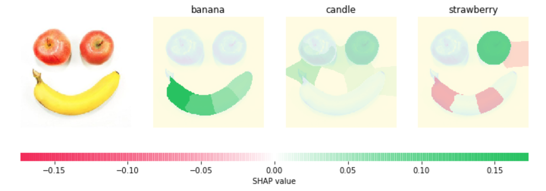
Explain the interaction values by SHAP
Goal
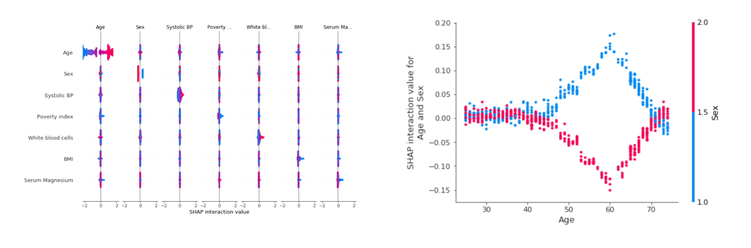
This post aims to introduce how to explain the interaction values for the model's prediction by SHAP. In this post, we will use data NHANES I (1971-1974) from National Health and Nutrition Examaination Survey.
Reference